The reference I was using for the build was Jim Yuen's "GabWhackers: A Comparison" which features dimensions for three different replica staffs - the Creation Official, WarriorNutCase, and Soundwarrior. The table of dimensions and colours would ultimately prove invaluable, but would inevitably be deviated from as I tried to adjust my custom staff to my own height.

For the wraps and grips, I purchased some cheap leather offcuts, cream garden twine, some purple and black cotton with a tribal print, and in the absence of anyone selling fake fur in anything smaller than a meter, a white anorak trim which would have to be unpicked and flattened to be wrapped around the neck of the staff.


The first step was trimming and shaping the dowl. I decided because of my height I wanted to make my staff relative to the extra four inches I have on Renee. She's 5'4" and I'm 5'8" - so if we assume the 64.5" official staff is accurate (we're assuming a lot here but this is all I have to go on) I can work out a suitable length using simple ratios. For anyone who doesn't remember GCSE mathematics, or perhaps never did ratios, here's how this works:
5'4" = 64", so that's basically a ratio of 1:1 (one inch of staff to every one inch of actor) plus half an inch. So if I make mine 68.5" then that's going to be as near as.
Or alternatively:

64.5
/64
=1.0078125
x68
=68.53125
Class dismissed. Remember to bring your homework.
Boring part done, let's say 68.5 and call it a day. So we lopped the excess off with a saw. Next I had to flatten down the smooth curves sides of the dowl with an electric sander. I wasn't going to aim for the octagonal shape of the official staff, as this would have reduced the diameter by too much and been quite difficult for someone like me who has no real woodworking experience. I just wanted to give it a raw, uneven finish so it looks hand carved and a little bit "rough and ready".
 The easiest and quickest technique for this was to grip the dowl in a Workmate and run an electric sander up and down to shave off the smoothness. This was done in about 20-30 minutes with minimum sweat and a lot of sawdust. The end result, as you can see, a not-quite octagonal look but certainly a dowl with flatter sides as if hand shaved.
I left the surface as it is without further hand-sanding, as the rougher finish will show up better under a coat of woodstain.
For colour, I wanted an oak woodstain with a matte finish. There are no glossy varnishes in ancient Greece after all! I used a nice cheap B&Q own-brand wood stainer, partly because I am a tightwad and partly because I don't really want a professional-looking even finish - I wanted a finish that looks liked Gabby rubbed it down with some oil while sitting by the fire in a wood somewhere. It only came in satin, but with the rough unfinished wood surface it wouldn't show up with too much of a shine, and at half price it was only £2.58 for a 250ml tin! Perfect for my little stick!
 In order to prevent getting stain on my fingers - or fingerprints on my stain - I hung the staff from the washing line using a nail and a bit of wire. I hammered a nail into one end of the staff, bent it with pliers to a 90 degree angle, twisted a loop of wire over the washing line and hung the staff from it. This meant I could paint the stain onto the wood without ever having to touch the tacky surface.
It was at this point with the stain going on that I was suddenly able to see the areas which I had missed with the sander - long strips of smoother, treated wood where the stain did not take to quite such a deep colour. This wasn't a bad thing though. The varied, uneven effect on the colour gave a natural finish, highlighting different faces of the wood to enhance the hand-carved look I wanted to create. Many of these little areas were fine lines in between the sanded faces of the staff, giving a nice effect.
 Once the stain was dry, the wrapping could be applied. Jim's measurements for the different staffs differ greatly but I decided to use the official staff as my basic guide. As this was intended to be a series 1 staff, I noted that the biggest difference aside from the colours and the fluffier fur was that the leather pieces were bigger. As such, the easiest way to extend the dimensions of the Creation staff to fit mine was to simply make all those leather pieces 3 inches instead of 2. I also wanted to even out the grips so the staff was symmetrical, and so (ignoring the .25 on the upper grip as this isn't even included in the total) I evened the two grips out to 4.75 inches each.
I applied the fabric first, using PVA glue on the majority then super-glue to secure the edges, then measured to find the centre point. 4.5 inches either side of this I marked the beginning of the grips, then 4.75 further still marked the leather.
 I cut the leather into 3" strips and applied them also with PVA and a little super-glue. I could now start applying the twine. The spiral binding requires TWO pieces going in opposite directions so I cut two long pieces of twine, secured each at the end near the leather and began to wrap. With each circuit around the wood I secured the twine with a spot of superglue. Once the required 4.75 inches was covered, I began the spiral wrap. Here the twine was also secured at the points where it met and overlapped the twine going the other way, and once I reached the grip at the other end I trimmed and tucked the end into the corner where grip meets spiral, and secured with a a little glue, as shown here.
The fur and leather at the top is far simpler. Again I cut two strips of leather 3" long and, leaving a 2.5" gap at the top, secured them to the wood with PVA leaving a 3" gap in between. I wanted to make sure the fur was the last piece to be applied so as to avoid getting glue on it, as this would be the part which would show up the most if I did! Being an anorak trim, I had to unpick and remove the cotton tape from the back, leaving a strip of backed fur about 1" wide. In order to create a smooth top and bottom edge to the fur section, I had to trim this strip to a point at the end. Word of note: when trimming fur, be sure to push the pile AWAY from where you are cutting, otherwise you may end up with dodgy looking short, blunt fur near the trimmed edge. I wanted to avoid messy splodges of PVA when it came to the fur, so the whole thing was applied with little dots of super-glue and carefully held down in tiny stages. In the end I glued the fur in about ten separate points, making sure each one was secure before moving on and glueing the next bit.
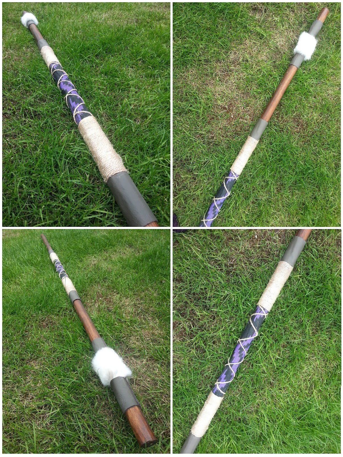
Once the textiles were secure I could set about weathering them - also known as "making it look like it's been dragged through the mud a bit". For this I mixed a couple of shades of brown acrylic and watered them down so I could put a muddy brown wash over the twine, giving it darker patches. I also used a weathering spray in a dirty grey-brown to dull the brilliant white of the fur in places, and sandpapered the leather in spots to make it look scuffed and battle worn.
The finished staff looks pretty close to the series 1 version, as well as having a nice authentic "homemade" look. More photos to follow when I take both my finished costume and hittin' stick out into the woods for a photo shoot! In the meantime though, here's some shots of the staff. I'm pretty proud of this one - but as always I know what I can do to make it better!
Boring part done, let's say 68.5 and call it a day. So we lopped the excess off with a saw. Next I had to flatten down the smooth curves sides of the dowl with an electric sander. I wasn't going to aim for the octagonal shape of the official staff, as this would have reduced the diameter by too much and been quite difficult for someone like me who has no real woodworking experience. I just wanted to give it a raw, uneven finish so it looks hand carved and a little bit "rough and ready".
I left the surface as it is without further hand-sanding, as the rougher finish will show up better under a coat of woodstain.
 |
| "You can do it if you B&Q it!" |
It was at this point with the stain going on that I was suddenly able to see the areas which I had missed with the sander - long strips of smoother, treated wood where the stain did not take to quite such a deep colour. This wasn't a bad thing though. The varied, uneven effect on the colour gave a natural finish, highlighting different faces of the wood to enhance the hand-carved look I wanted to create. Many of these little areas were fine lines in between the sanded faces of the staff, giving a nice effect.
I applied the fabric first, using PVA glue on the majority then super-glue to secure the edges, then measured to find the centre point. 4.5 inches either side of this I marked the beginning of the grips, then 4.75 further still marked the leather.
 |
| Anorak trim comes pre-prepared with cotton tape carefully designed for application onto anoraks. Needs to be carefully removed for application onto anything else. |
The fur and leather at the top is far simpler. Again I cut two strips of leather 3" long and, leaving a 2.5" gap at the top, secured them to the wood with PVA leaving a 3" gap in between. I wanted to make sure the fur was the last piece to be applied so as to avoid getting glue on it, as this would be the part which would show up the most if I did! Being an anorak trim, I had to unpick and remove the cotton tape from the back, leaving a strip of backed fur about 1" wide. In order to create a smooth top and bottom edge to the fur section, I had to trim this strip to a point at the end. Word of note: when trimming fur, be sure to push the pile AWAY from where you are cutting, otherwise you may end up with dodgy looking short, blunt fur near the trimmed edge. I wanted to avoid messy splodges of PVA when it came to the fur, so the whole thing was applied with little dots of super-glue and carefully held down in tiny stages. In the end I glued the fur in about ten separate points, making sure each one was secure before moving on and glueing the next bit.
 |
| Grubbification! |
The finished staff looks pretty close to the series 1 version, as well as having a nice authentic "homemade" look. More photos to follow when I take both my finished costume and hittin' stick out into the woods for a photo shoot! In the meantime though, here's some shots of the staff. I'm pretty proud of this one - but as always I know what I can do to make it better!


